Neon colors are bold, striking, and memorable – they can easily add energy and excitement to your projects, making your designs stand out from the rest.
Traditionally, neon colors are associated with fun, parties, and over-the-top fashion. In line with the revival of the 1980s, neon colors have also lit up (pun intended) the design space as a graphic design trend in recent years.
But choosing the right neon color palette for your design is tricky as neon colors aren’t really versatile. To avoid having gaudy or tacky designs, we’ve created some unique neon color palettes to inspire you, along with tips on how and where to use them.
What Are Neon Colors
Neon (or fluorescent) colors are extremely bright versions of primary and secondary colors, such as blue, red, green, yellow, and purple.
Fluorescent colors stand apart from other types of color due to the fact that they emit light, making them luminescent. When the emitted light falls in the visible spectrum of light that can be seen by the human eye, the luminescence is rendered in color.
When to Choose A Neon Color Palette
Neon colors are definitely not for everyone or every brand. Here are some pointers on when a neon color palette might be right for you or your brand:
- You’re in the creative industry or other competitive markets such as beauty, fashion, and tech.
- You’re looking to cut through the noise and make a bold statement.
- You want an edgy and unique look for your personal branding.
1. Mojito & Blue Skies
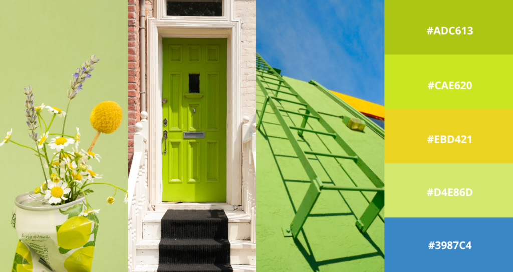
Electrifying and refreshing – this lime green and azure blue pairing are perfect for cutting-edge designs as both colors balance out each other very harmoniously. This color palette works well for industries such as tech, architecture, and design.
2. Aqua Mint
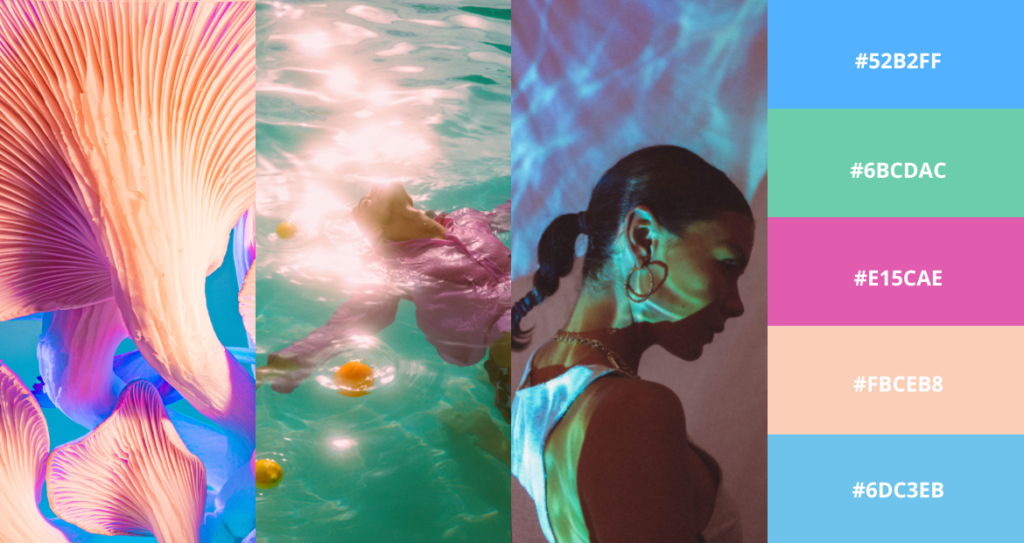
Consisting of turquoise, teal, and neon purple, this candy-colored palette is fun, flirty, and feminine. These colors are ideal for product packaging, digital illustrations, logo design, and even photography.
3. Primary Power
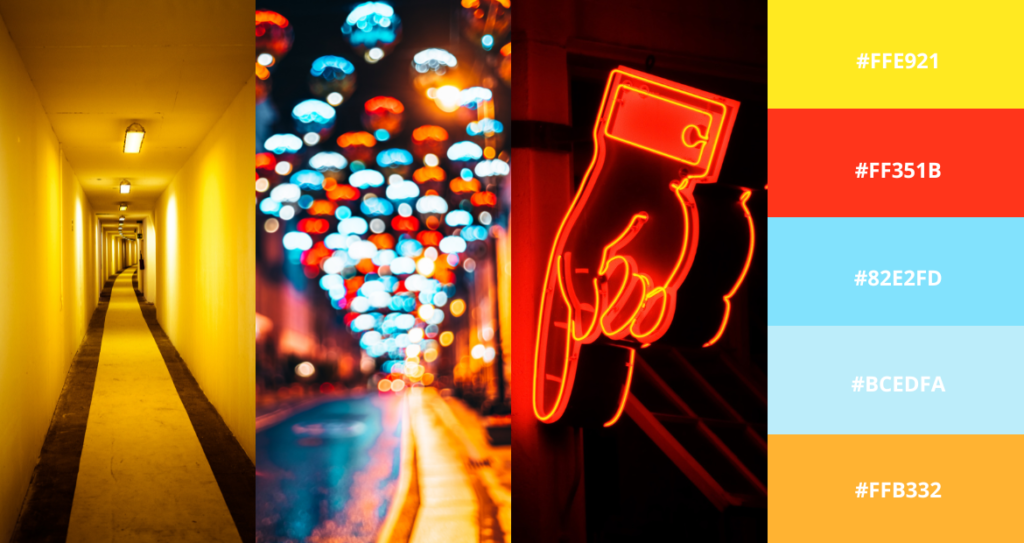
Primary colors are already powerful, so just imagine the power of neon primary colors. The combination of neon red, blue and yellow is bound to create a lasting impression as it overwhelms your senses with its somewhat maximalist approach. It’s great for experimental branding and packaging, or simply displaying a fun brand personality.
4. Ultraviolet
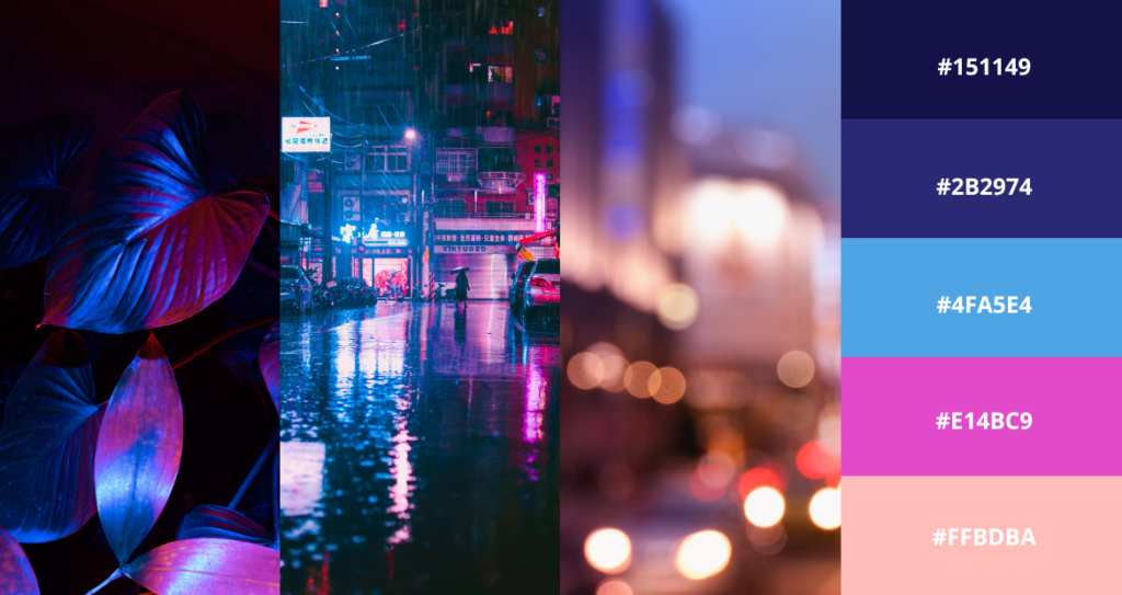
Mysterious yet inviting – this psychedelic color palette looks straight out of an R&B music video or a scene from the movie Blade Runner 2049. The neon purple and pastel pink are anchored by the deep indigo and ultramarine blue, making this color palette perfect for anything beauty and fashion-related.
Brighten Your Designs with Pixlr Today!
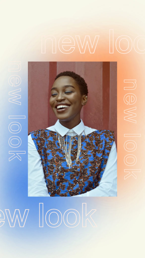
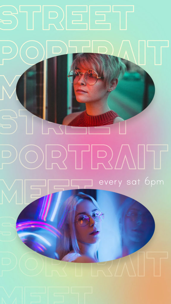
Here are some examples of how we choose to utilize neon colors in our Pixlr designs.

Now that you know all the tips on how and where to use neon colors, you can now skillfully incorporate them into your designs by using Pixlr without worrying about overdoing it.