If you’ve been anywhere near the digital landscape lately (and let’s be real, who hasn’t?), you’ve probably noticed a certain trend making waves. Minimalism. Yup, it’s not just for those decluttering TV shows—it’s the hottest trend in design too. Think sleek lines, crisp colors, and the “less is more” mantra.
And guess what? Today, we’re diving into how YOU can master the art of minimalist design in Pixlr. Not only that, but we’re also gonna throw in a sprinkle of magic by tying in some double exposure techniques. Ready to channel your inner Picasso-meets-Marie-Kondo? Let’s roll!
1. Understanding Minimalism
Before you unleash your creativity, it’s key to understand what minimalism in design really means. It’s all about simplicity, clarity, and emphasizing what’s important. It doesn’t mean being boring or plain—it means making strategic choices about what to include and what to leave out. The aim? To communicate a message or vibe as clearly and elegantly as possible.
2. Setting Up Your Pixlr Workspace
 Start with a blank canvas. Choose a size that fits your project (whether it’s an Instagram post, a blog header, or whatever floats your boat). And hey, remember, a clear workspace = a clear mind!
3. Picking Your Color Palette
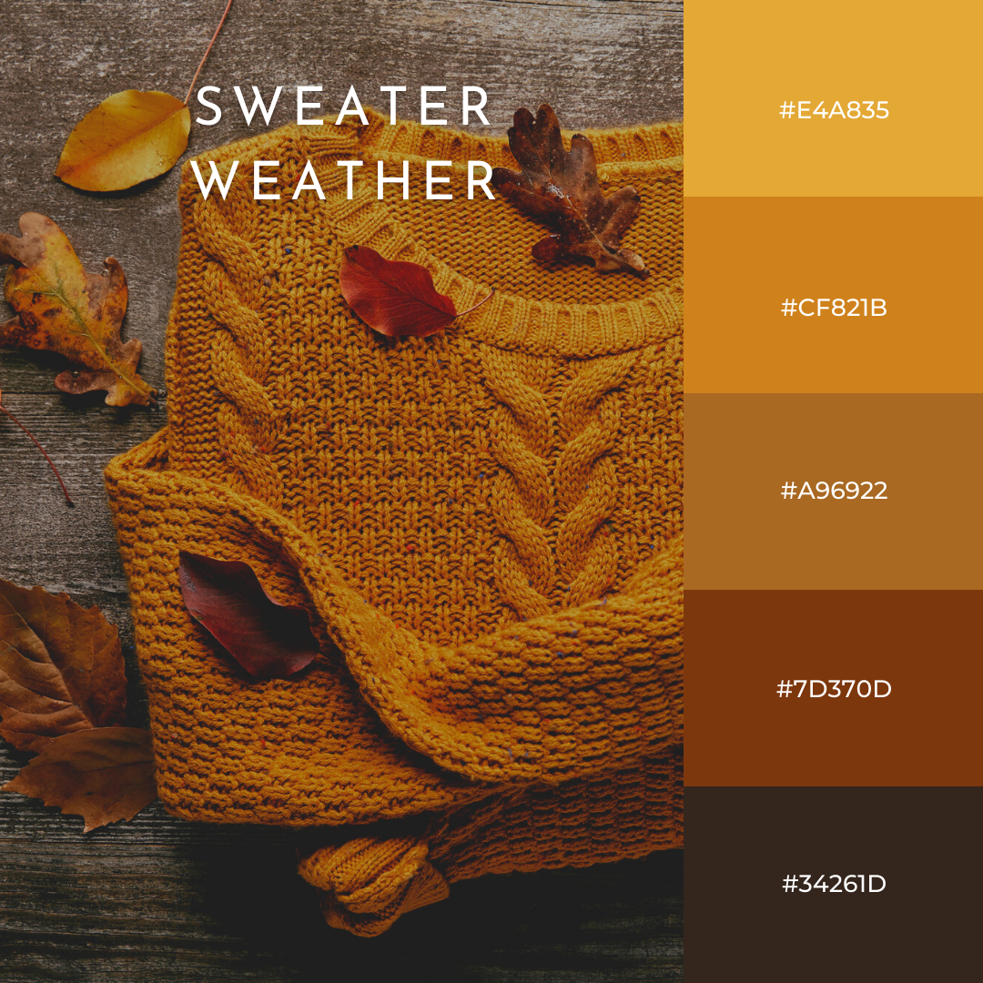
Here’s a pro tip: limit your colors. Choose 2-3 primary colors that align with the mood you’re trying to convey. Maybe you want calming blues or fierce reds. Whatever you pick, make sure they complement each other.
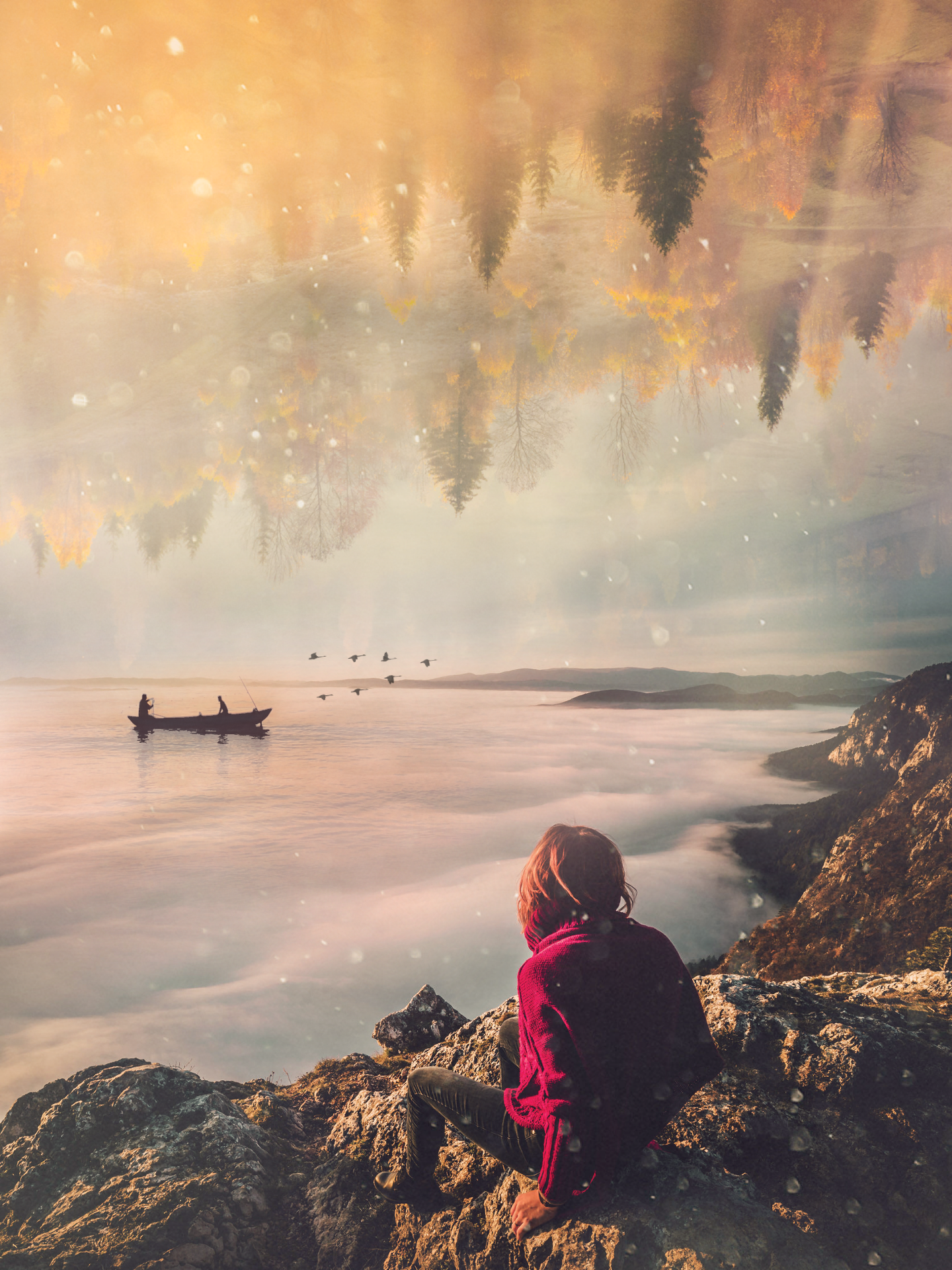
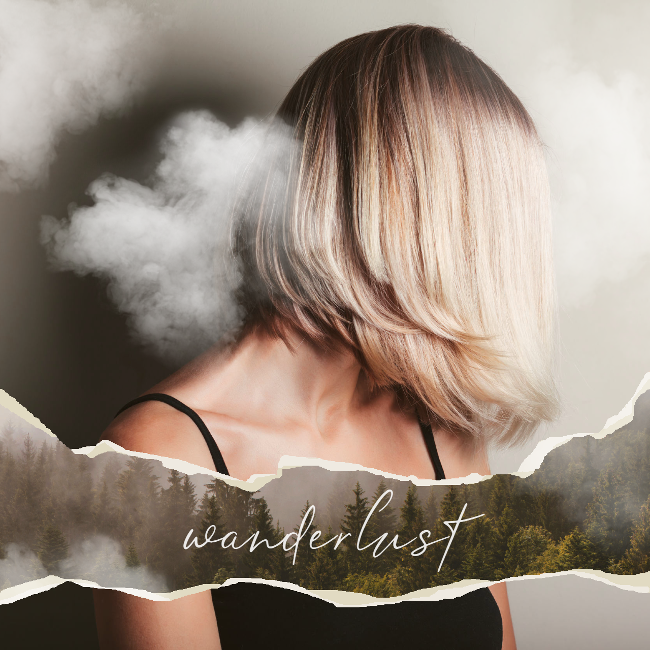
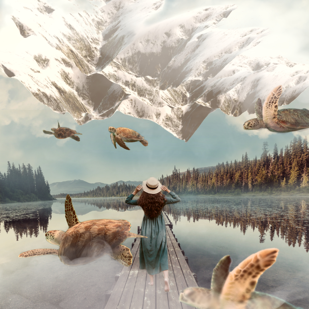
4. Adding Some Double Exposure Magic
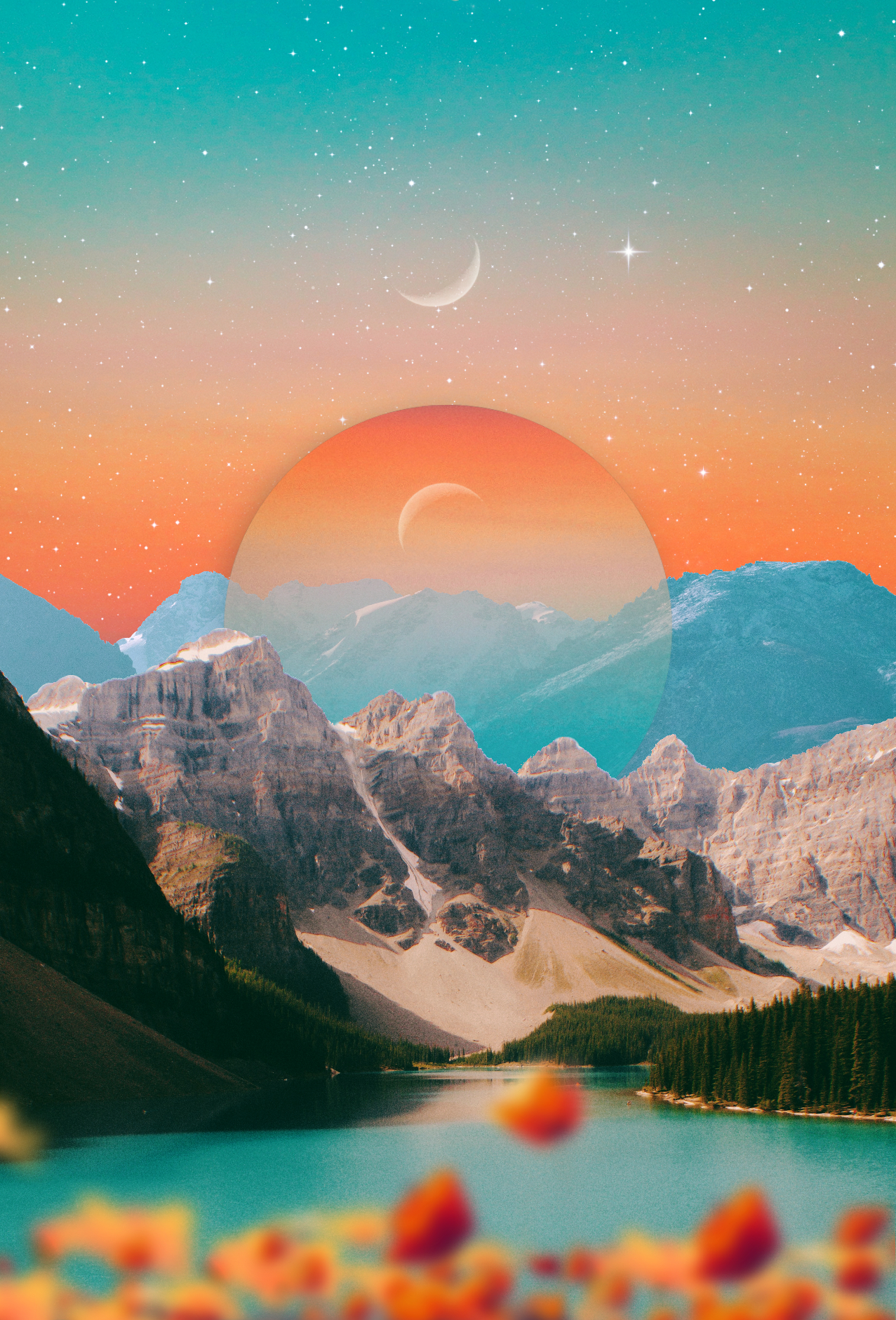
Ah, the pièce de résistance! You’ve probably seen those super cool photos that combine two images in one, right? That’s a double exposure, and it can elevate your minimalist design to a WHOLE new level.
To do this in Pixlr:
- Choose your two images—one as a base and another as a layer.
- Play with the layering tools. This will allow your top image to overlay your base image.
- Adjust the opacity of your top image so that both images are visible, blending seamlessly.
Bam! You’ve got yourself a minimalist double-exposure masterpiece.
5. Typography Time!
If you’re adding text, go for fonts that are simple and legible. Remember, minimalism is all about clarity. But don’t fret! Simple doesn’t mean snooze-fest. With the right font, your design can scream (or, you know, elegantly whisper) “cool and sophisticated.”
6. Keep It Balanced
Balance is the name of the game. Ensure there’s enough white space (or negative space) to let your design elements breathe. This space isn’t just an empty area—it’s a crucial part of your design that helps highlight what truly matters.
7. Final Touches
Zoom out. Take a look. Adjust. Zoom in. Check details. Adjust some more. You get the gist. Perfection is in the details, and those finishing touches can make or break your design.
And there you have it! A trendy, minimalistic design with a sprinkle of double exposure magic, all crafted in Pixlr. Easy, right? The best part? The more you play around, the better you get. So don’t be afraid to experiment and make that design uniquely YOU.
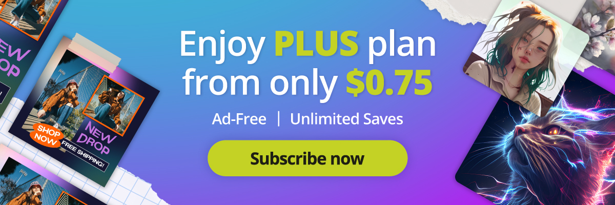
Create a double-exposure effect with Pixlr, today!
Now, go out there and drop those jaws with your newfound design skills! And remember, in the world of design, sometimes less truly is more.
Share your artwork with us by tagging @pixlr on Facebook, Instagram, and TikTok for a chance to be featured on our feed!