As 2022 comes to a close, all eyes are on Pantone to reveal its highly anticipated Color of the Year for 2023. This annual selection is made by a panel of experts who study and analyze current trends, cultural influences, and global happenings to determine the hue that best reflects the mood and spirit of the times. The Pantone Color of the Year has become a significant event in the design world, with companies and individuals looking to incorporate the chosen shade into their products and spaces.
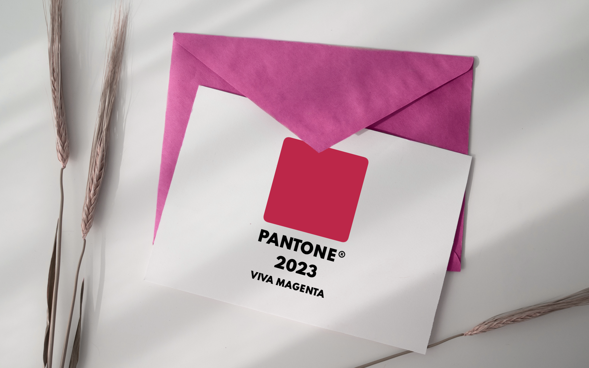
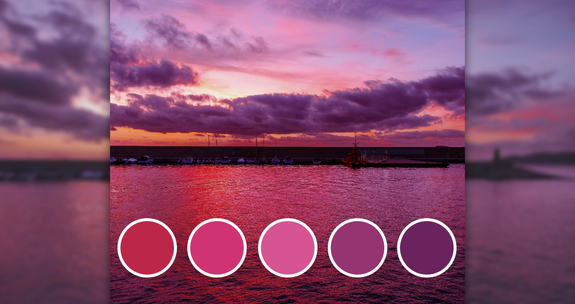
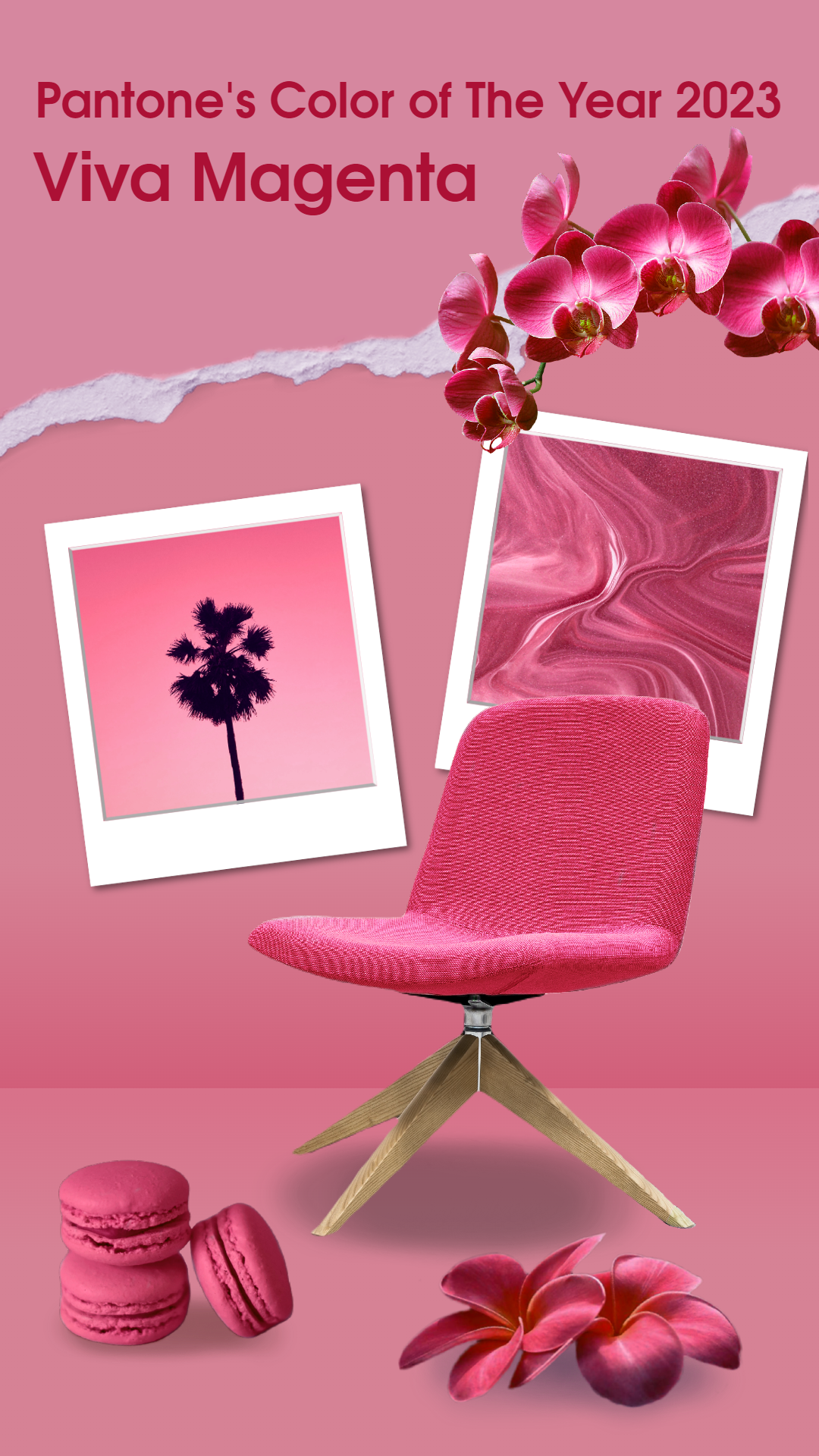
That said, Pantone has announced their Color of the Year for 2023 to be Viva Magenta 18-750, a bold and vibrant shade that will turn heads and make a statement. This electric hue is a powerful and energetic color that evokes feelings of excitement and passion and is sure to bring a touch of boldness to any project. Whether you use it as an accent or make it the star of the show, Viva Magenta is the perfect choice for adding some extra pizazz to your space. So let’s embrace the bold and embrace Viva Magenta as we kick off the new year and make a statement with “New Year, New Pantone”!
What is Viva Magenta?

Viva magenta is a bright, vivid shade of pinkish-purple. It is a synthetic color made by mixing equal parts of red and blue pigments. The resulting color is often described as a vibrant, bold, and lively hue perfect for adding a pop of color to any design. Some examples of places where you might encounter viva magenta include logos, brochures, posters, websites, and social media ads. It can also be found in fashion, accessories, and home decor items.
Why is it called Viva Magenta?
The term “viva magenta” is a proprietary name coined by the Pantone Color Institute, a company specializing in color matching and communication. The word “viva” is derived from the Latin word “vivus,” meaning “alive” or “vibrant.” The term “magenta” refers to a specific shade of pinkish-purple, often associated with energy, creativity, and boldness. Together, the name “viva magenta” suggests a lively, vibrant shade of pinkish-purple that is perfect for adding a pop of color to any design.
Why is Viva Magenta becoming a trending color?
Viva magenta may have become popular due to its association with creativity and innovation and its high versatility. Here are some of the possible factors:
Bold statement color: Viva magenta is a bold, vibrant hue that can make a strong statement when used as a primary color in a design. It is often used to add energy and excitement to a design and can be effective at grabbing attention and drawing the eye.
Accent color: Viva magenta can also be used as an accent color to add visual interest and highlight specific elements in a design. It can be paired with neutral or complementary colors to create balance and contrast.
Flexibility: Viva magenta is a color used in various design styles, from modern and minimalistic to traditional and ornate. It can be incorporated into a variety of design schemes and can work well with a range of materials and textures.
Viva Magenta and its significance
Viva magenta is a specific shade of pinkish-purple known for its bright, vivid hue. It is different from other purple tones in that it tends to be more vibrant and attention-grabbing and is often described as a lively and energetic color.
Viva magenta is significant as a digital trend because it is a popular color in digital media, often found across various websites and social media platforms. It is often used as an accent color to add visual interest and draw attention to specific elements on the page. The bright, bold nature of viva magenta makes it a practical choice for creating engaging and eye-catching designs in the digital realm.
In general, purple is often associated with creativity, luxury, and sophistication, and shades of purple can convey different moods and emotions. Viva magenta is no exception, and its bright, lively hue can add a sense of energy and excitement to a design. It is different from other purple tones in that it tends to be more vibrant and attention-grabbing and is often used to make a bold statement or to grab the viewer’s attention.
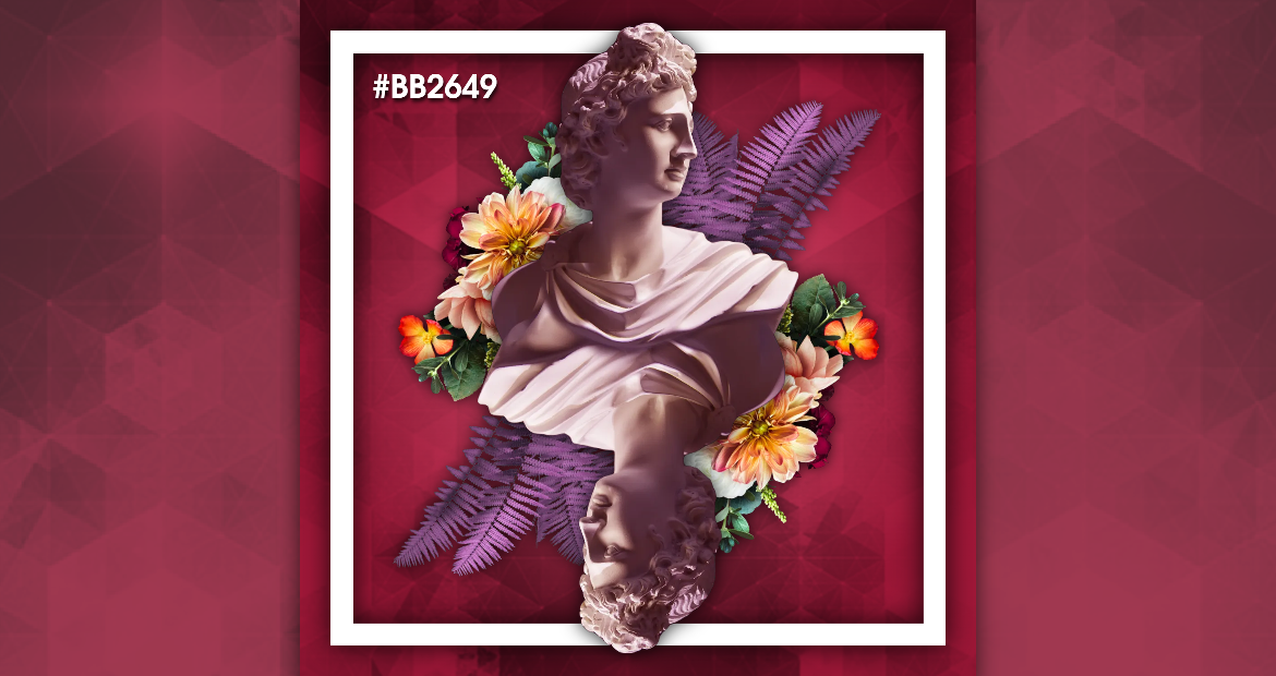
Create Viva Magenta-themed designs with Pixlr
Viva magenta is a bright, vibrant hue that is highly suitable for creating a sense of otherworldly or surreal atmosphere in artworks. The bold, attention-grabbing nature of the color can help draw the viewer’s eye and build a sense of awe and excitement.
In addition to its bold visual impact, viva magenta can also create distinct contrast and dissonance within an artwork. When paired with more muted or neutral colors, viva magenta can help to develop a sense of tension or disjunction, which then conveys a sense of surreal or dreamlike quality within the composition.
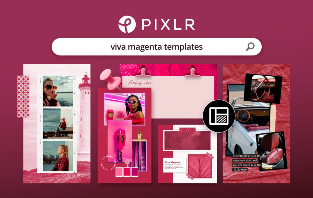
Head to Pixlr Templates for more here.
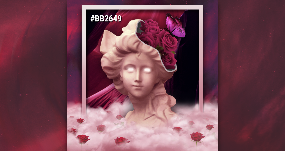
If you want to explore the wonders of designing with viva magenta and create surreal artwork, then allow us to introduce you to Pixlr Suite! Pixlr Suite is a creative hub for your creative needs, filled with many photo editing tools and apps that enable users to edit and manipulate digital images.
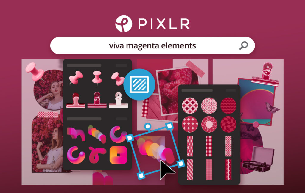
Create with Pixlr Viva Magenta-inspired elements here.
The suite includes various tools and features such as filters, overlays, text and sticker tools, and basic editing options like crop, rotate, and resize. Most importantly, Pixlr is designed to be easy to use and welcomes users of all skill levels, making it a popular choice for amateurs and professionals.
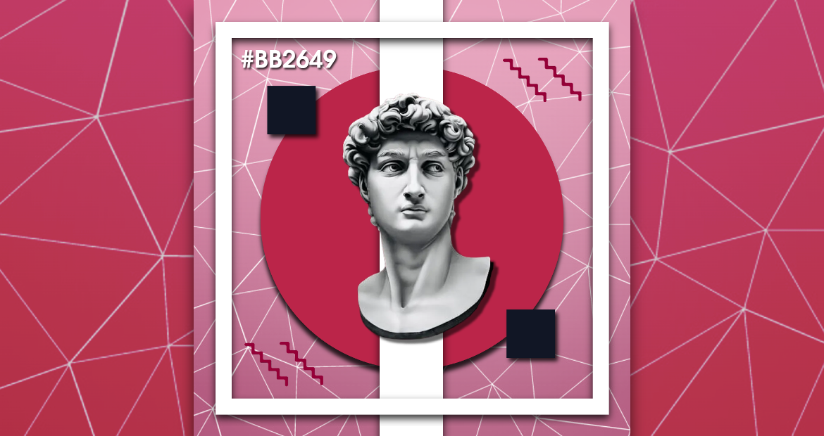
Overall, viva magenta is a bold and attention-grabbing color that can be used effectively to create various effects and is highly versatile in visual media, architecture, and graphic design.
What are your thoughts on Pantone’s Color of the year? Start designing now and tag us @pixlr on Facebook and Instagram for a chance to be featured on our feed. Do consider joining our FB Community and Discord Channel too!