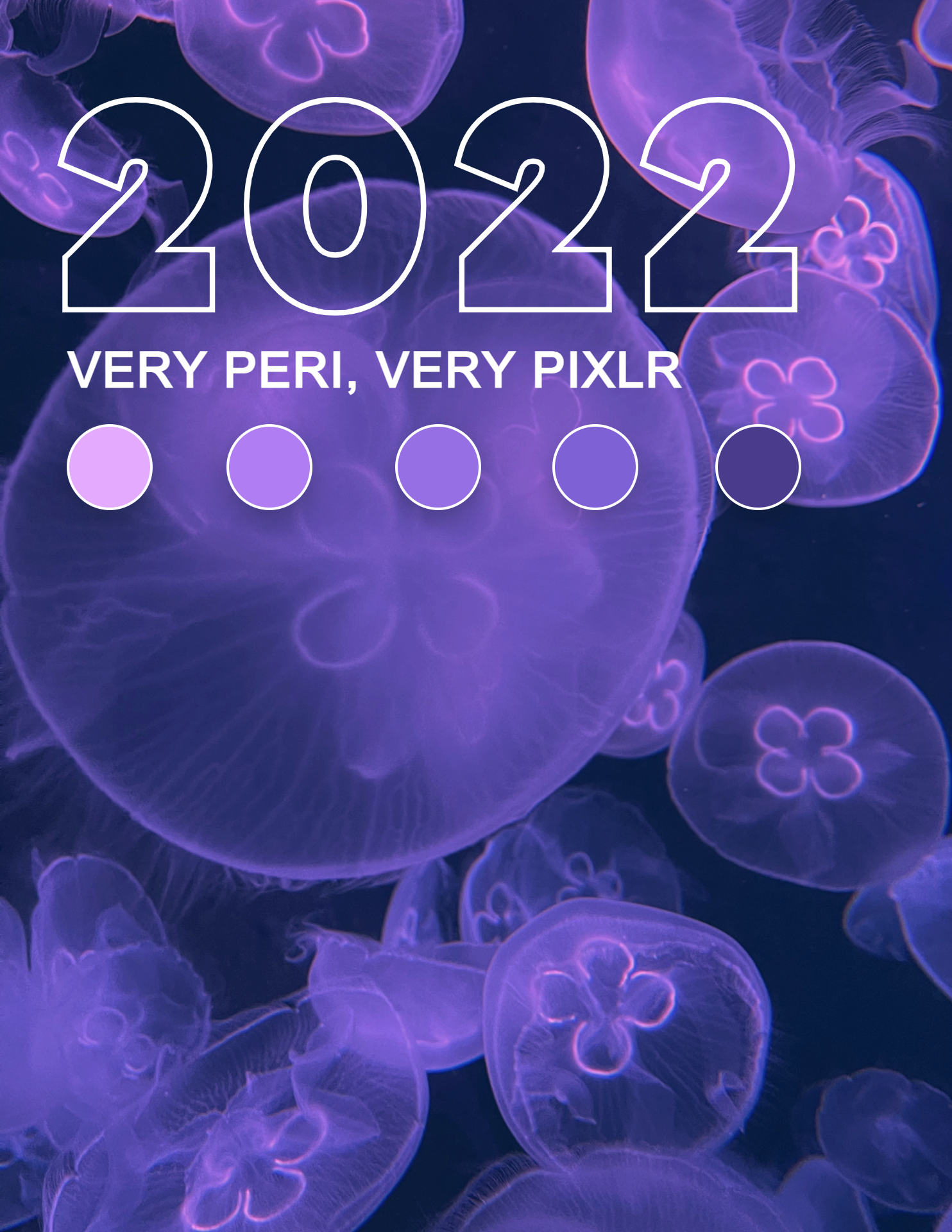
Let’s welcome 2022 with the color that symbolizes courageous creativity – Very Peri!
In celebrating our perseverance to thrive under the new normal in 2021, PANTONE has announced an intriguing shade called Very Peri to be 2022’s Color of the Year.
This shade ultimately asserts boundless joy, daring curiosity and personal creativity, which would be the perfect attitude in anticipating our journey this year.
Created with Pixlr E.
With its well-loved qualities from the blue color family combined with its violet red undertones, Very Peri is here to help us confidently scour new opportunities. The color itself is transformative as it is significantly intertwined with digitalization. It goes without saying that Very Peri would help us gain a fresh new perspective to reimagine our lives this year.
Here’s how you can utilize Pixlr to welcome Very Peri into your 2022:
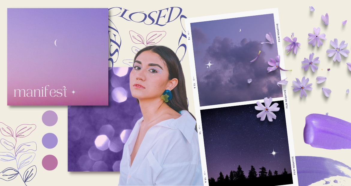
1. Create a Very Peri moodboard
Created with Pixlr E.
If you would like to manifest a lively, adventurous year ahead, why not show off Very Peri in your moodboards? It can be showcased in your Instagram feed, or it can even be a personal moodboard to keep track of your visual goals this year.
Either way, incorporating a color that oozes imagination such as this will surely keep your creative juice flowing all year long. Ultimately, Very Peri will be able to ease you in embracing new possibilities.
2. Turn your shots purple
As Very Peri itself is a combination of two color families, color grading to achieve aesthetically pleasing visuals is bound to happen. You may even have the idea of utilizing this shade to create a breath-taking scenery.
However, if you are short on the means to create a Very Peri-themed scenery, just head to Pixlr for quick yet stunning results. For one, our latest feature allows you to do color grading like no other. Simply follow the steps below:
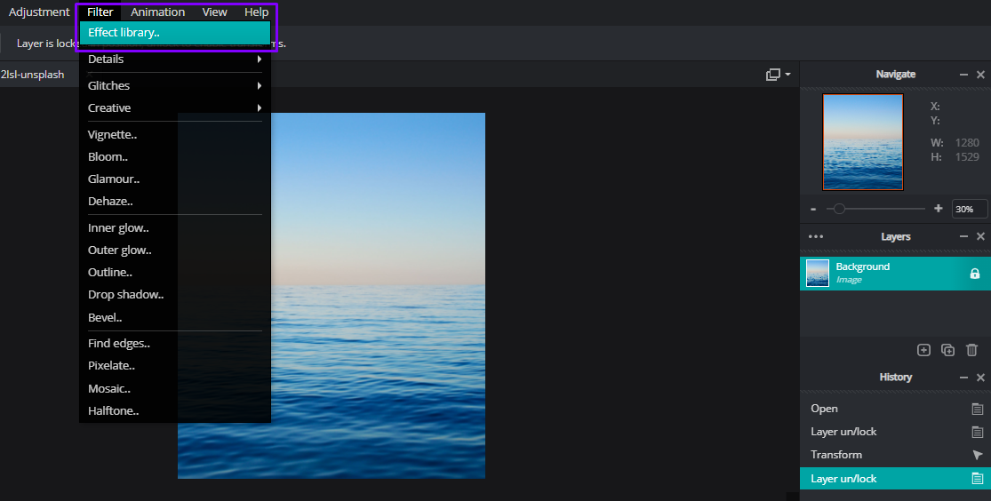
For instance, if you’d like to reimagine the scenery above bathed in Very Peri, you can upload it and head to Pixlr’s Effect Library located under the Filter tab.
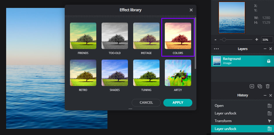
Next up, head over to the colors in adjusting the hues. You’ll see a filter titled Buldur that will transform the existing colors in your image into a Very Peri one.
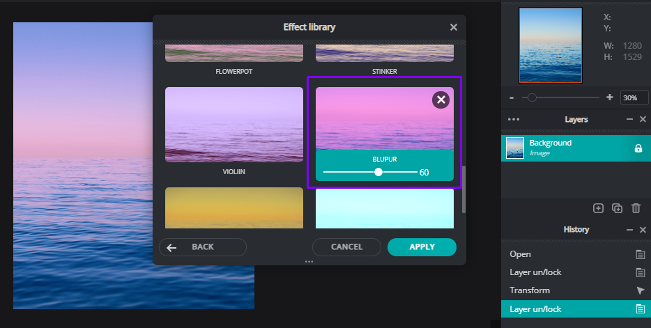
Lastly, you can adjust the temperature and the tint of the colors too. This will lead to a captivating color grading that shows off Very Peri’s hue like no other.
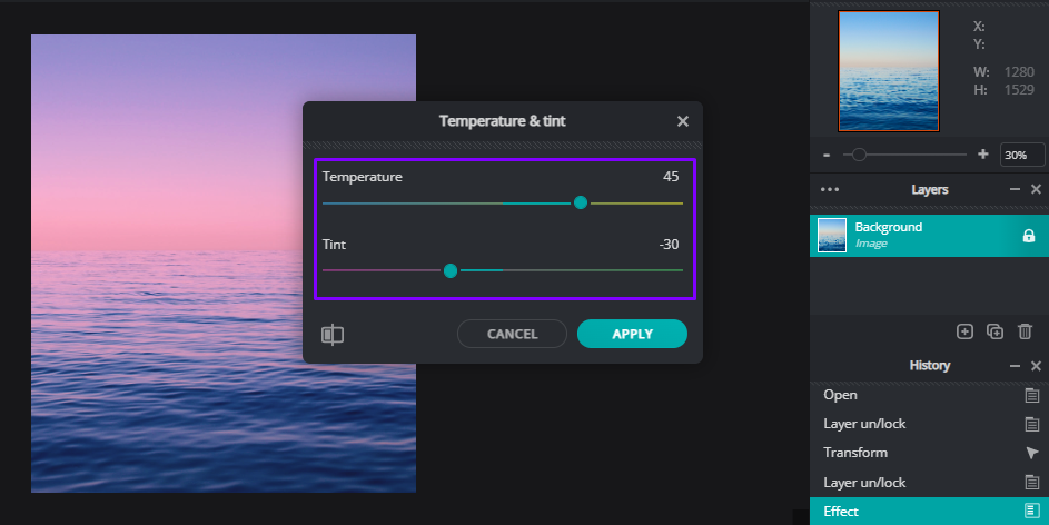
The end product will ooze liveliness and serenity at the same time, providing your target audience with just the right energy in kick-starting 2022.

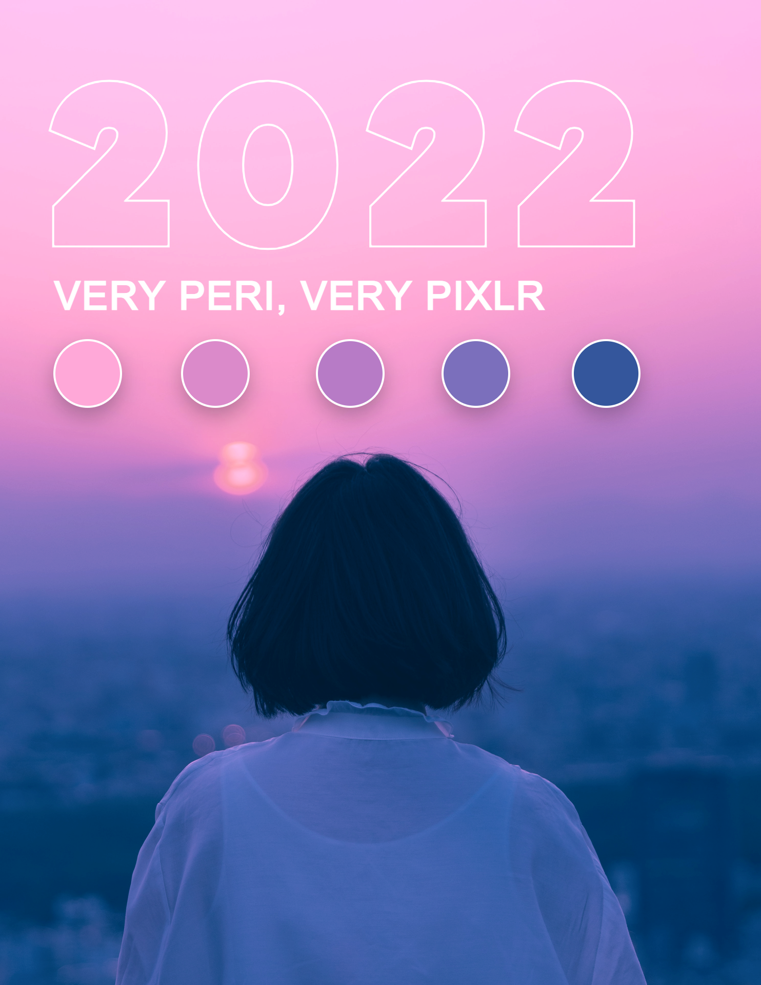
Created with Pixlr E.
3. Go crazy with purple!
Created with Pixlr E.
Incorporating this particular shade into your designs can be quite tricky. After all, purple is not exactly a common shade that can naturally be found in our daily lives.

Created with Pixlr E.
However, as Very Peri asserts curiosity and carefree confidence, be sure to be bold when it comes to using it to your advantage. Think purple! From purple texts, to backdrops, and even other design elements, don’t be afraid to throw in Very Peri for a creative mix.
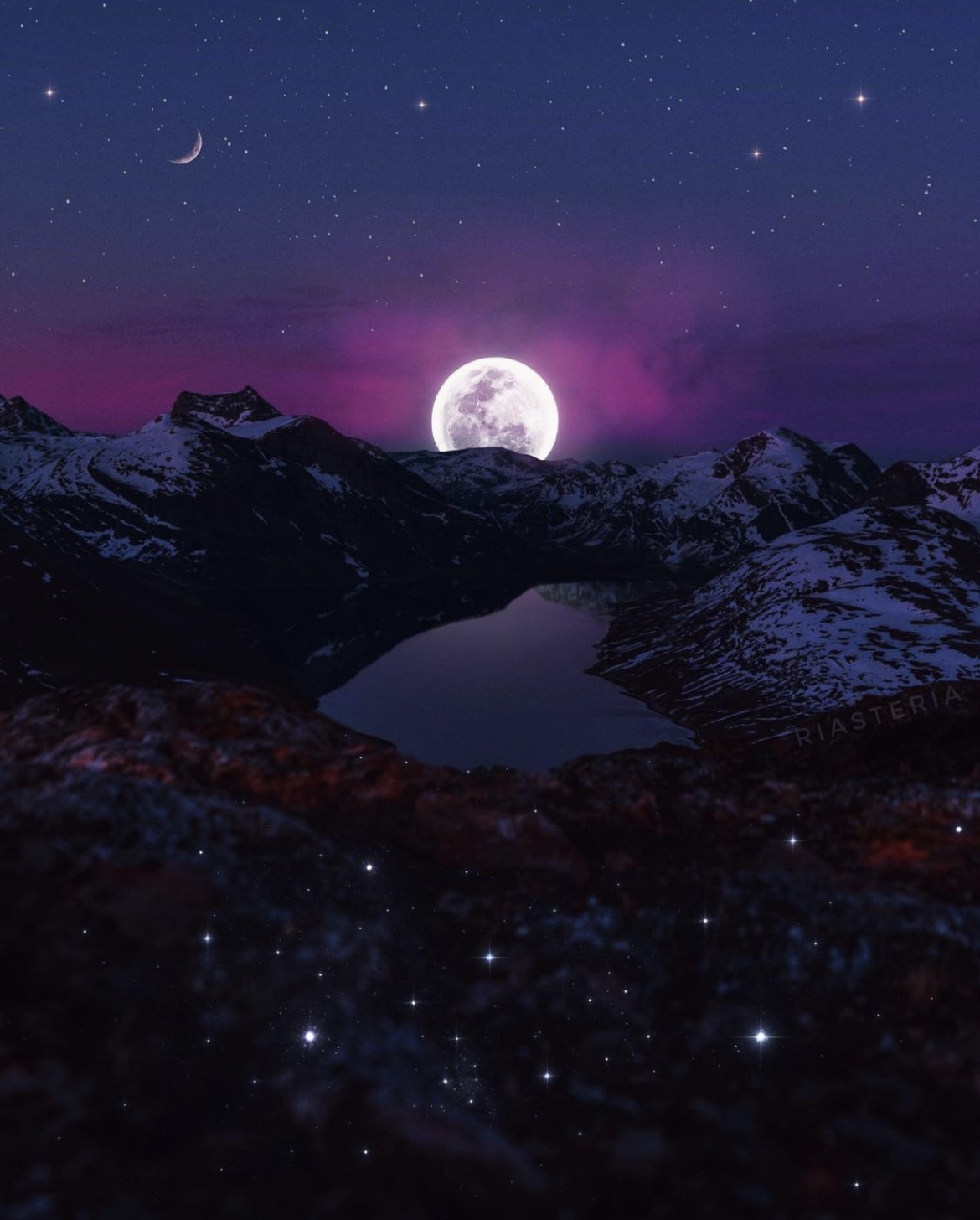
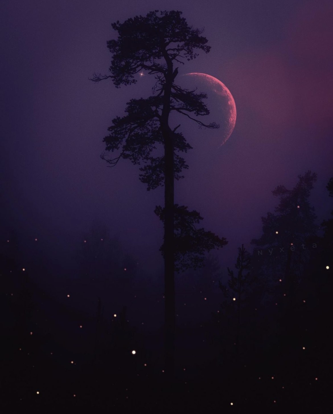
4. Create Very Peri dreamy artworks
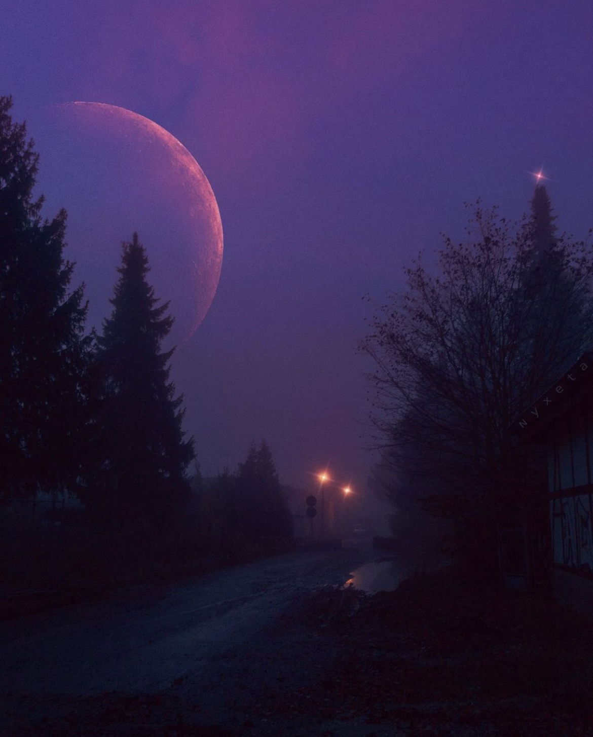
Dreamy purple artwork by Pixlr user @nyxeta.
What better way to add gentle surrealism into your edits than with Very Peri? With this shade, your artworks are guaranteed to look all the more alluring and mysterious at the same time.
Dreamy purple artwork by Pixlr user @nyxeta.
From enchanting collages to moonlit night views, you can of course rely on Very Peri to beautify your edits. As for the much needed editing tools, simply head to Pixlr for a vast selection of resources!
Dreamy purple artwork by Pixlr user @nyxeta.
Clearly, there’s no better color that would get you through this year like champ than Very Peri.
Let your imagination run wild, break free from our repetitive cycles in 2021 and paint your life in purple with Pixlr!