It’s that colorful time of the year again and we can’t wait to introduce you to Pixlr’s top 5 color palettes for Spring/Summer 2022!
According to Pantone Color Institute experts, this year’s color trends evince our aspiration for serenity and liberation as we stride into a brand new year and move through a changing landscape.
Hence, we’ve decided to merge both conflicting desires for comforting familiarity and exciting adventures, and create a harmonious blend of colors. Some are soothing and timeless hues that provide a sense of security and clarity, others are stand-out shades that celebrate playfulness and spontaneity. Here are Pixlr’s Spring/Summer 2022 color palettes:
1. Dream A Little Dream of Me
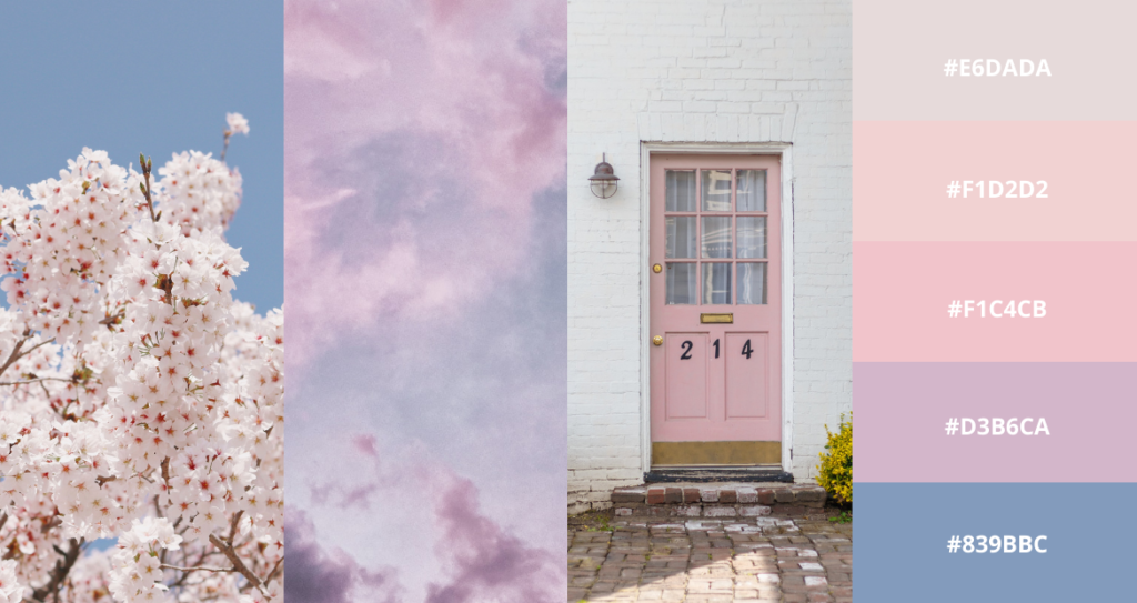
Color palette created with Pixlr E.
With soft lilacs and baby pinks, this muted pastel palette is the epitome of spring, evocative of dreamy nostalgia and hopeful beginnings. Pastel colors are subtle on the eye, typically seen as feminine or “girly.” But they can also deliver a range of emotions such as love, affection, calmness and peace.
If you’re a brand owner looking for a color palette that best suits your product/service, this color palette would be perfect for:
- Baby or maternity products
- Event planning
- Dessert shops
- Skincare products
2. Joyful Daffodil
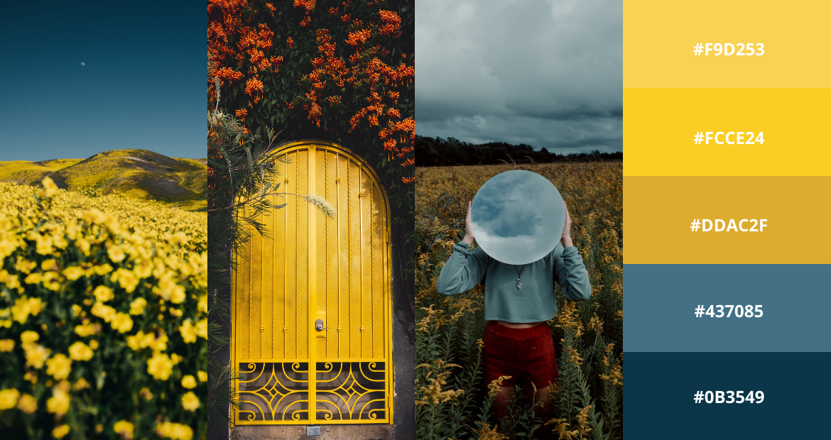
Color palette created with Pixlr E.
Bright happy yellows grounded by dark cyan and aegean blue, this color palette represents hope and optimism amidst raging storms. In this palette, the yellows act as the accent color that can be used in small doses, sprinkling sunshine onto the otherwise somber scheme of blues.
This palette would be ideal for products/services that center their branding around positivity, spontaneity and adventure. It also works well for brands that strongly advocate for a certain cause, such as mental health, cruelty-free, social change etc.

3. At Heaven’s Gate
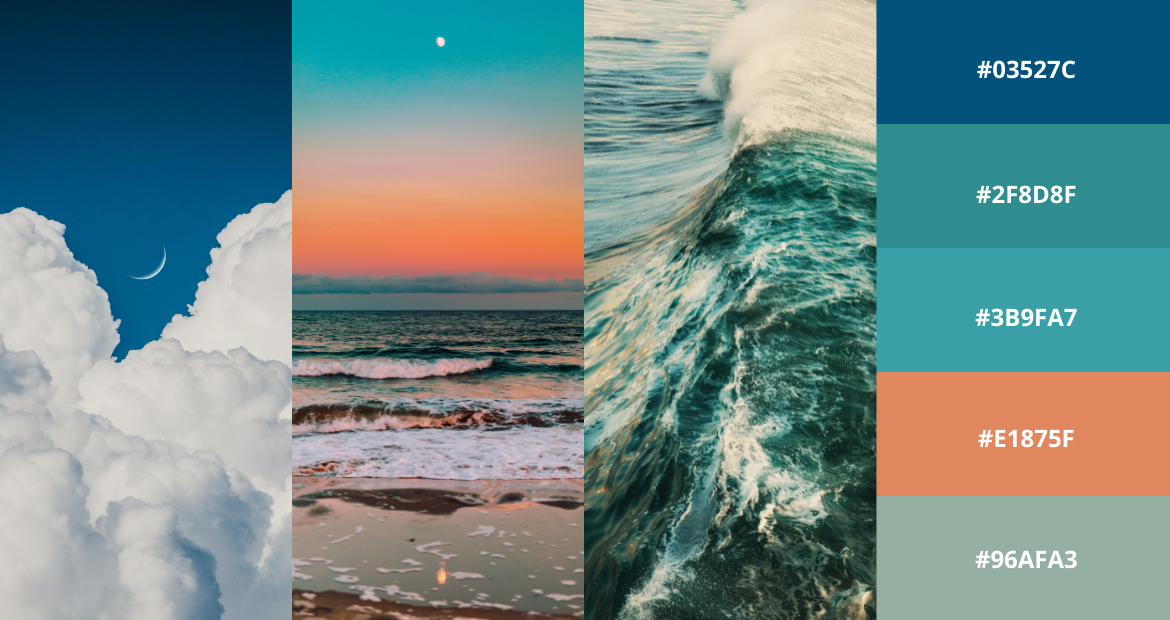
Color palette created with Pixlr E.
Serene aqua and xanadu paired with calming coral, this otherworldly color palette truly transcends earth and transports viewers to a surreal safe haven. The blues reflect our eagerness to search for a safe space, whereas the coral symbolizes the warmth and comfort of familiarity.
This color palette gets along splendidly with the pastel family, especially dusty yellows and pinks. It will add a hint of nostalgia to your design work, creating an overall fuzzy ambience.
We think this color palette will work well for travel and leisure brands that promote the wanderlust lifestyle, or home and furniture companies that sell knitted hammocks and scented candles.
4. Peri Paradise
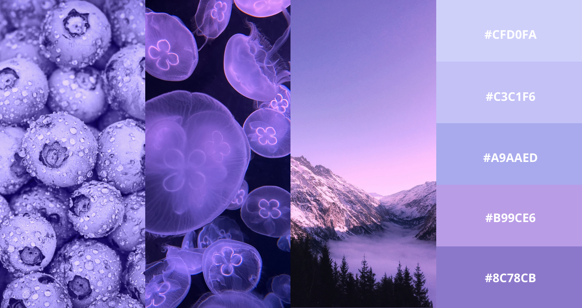
Color palette created with Pixlr E.
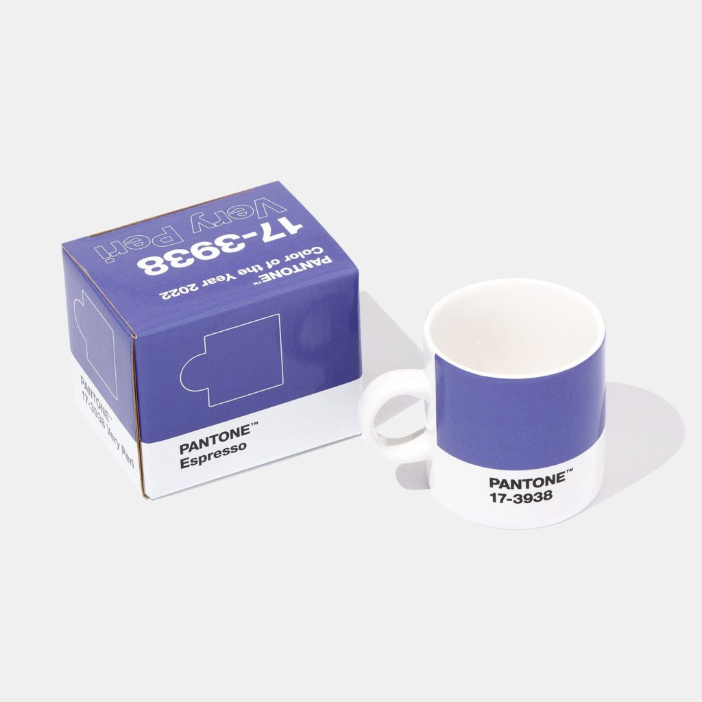
Inspired by Pantone’s Color of The Year – Very Peri, this color palette encompasses the different shades of purple, ranging from periwinkle to blue violet. This color palette displays a carefree confidence and joyous attitude, sparking creativity and encouraging personal inventiveness.
Any brand that is daring to push its creative boundaries can utilize this palette in their packaging, website design or social media posts. If you’re looking for ideas on how or where to incorporate these purple hues, check this out.
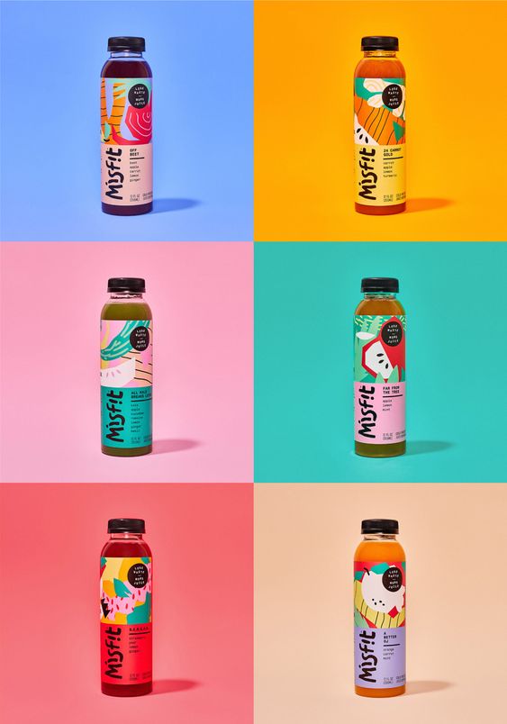
5. Poinciana Cocktail
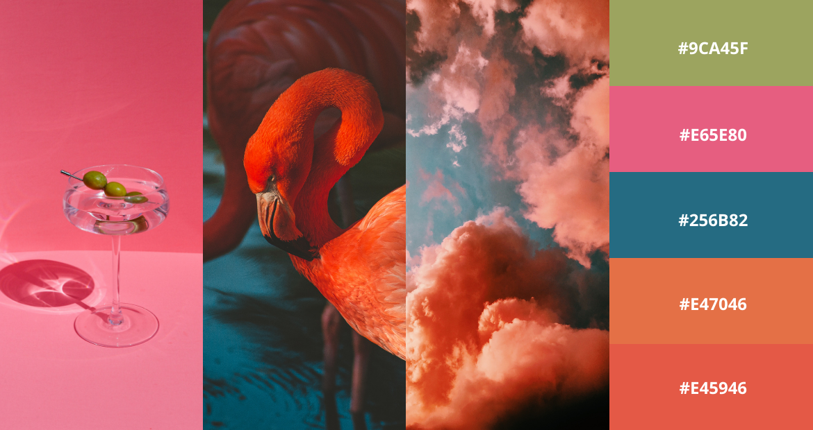
Color palette created with Pixlr E.
With a burst of vivacious pink, a punch of tantalizing orange, a shocking dose of olive green and a splash of turquoise, this delectable color palette is an instant mood booster that can brighten up any space and elevate any design.
Taking the art of color-blocking to the next level, this color palette favors the new, the exciting and the bold. We think it’s perfect for food and beverages, maximalist fashion labels, eclectic art accounts or any other brands that want to leave a lasting impression.
Live Life in Color
The power of color lies in human emotion – how we react to warmth or coolness, how we perceive bright hues or muted shades, how we feel when we see a contrasting palette versus a harmonious blend of colors.
It is a powerful tool, and when we are able to use it right, we can inspire our audience, we can spark joy and creativity, we can convey our message, we can tell our story.