Winter is finally over and spring has officially sprung! To welcome the warmer and brighter days, we’ve prepared 5 vibrant color palettes that encapsulate the essence of this beautiful season.
This spring, we want to inspire you to breathe new life into your creations and add a dash of color to your artworks.
So, here are the 5 color combinations that perfectly portray the season of spring, ranging from robin-egg blue and sage green to viva magenta and soft lilac.
1. A Hopeful Dawn
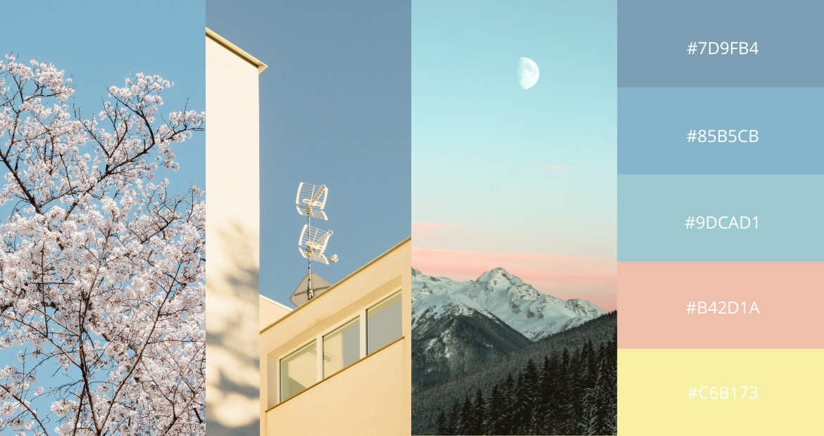 At the crack of dawn, the first ray of sunlight seeps in through the branches of cherry blossom trees, turning the sky pale pink and blue. Now, condense that scenery into a color palette, and this is what you’d get.
This pastel color palette is soft, dreamy and easy on the eyes. Pastel colors will never go out of style thanks to their versatility. They can be mixed and matched easily, perfect for product packaging, website designs, business cards, portfolio decks and many other things.
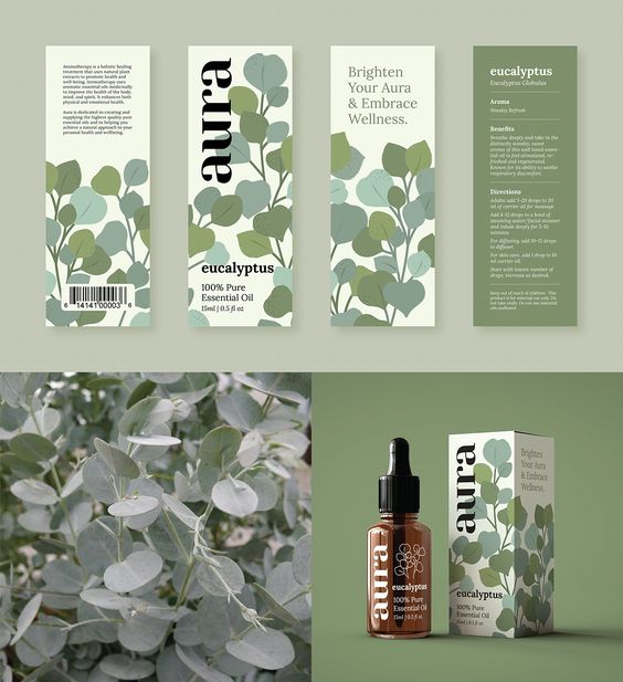
2. Serene Green
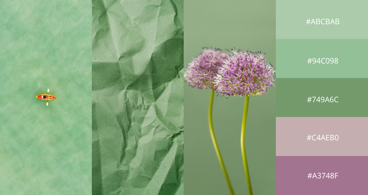 When we say green and purple make a good pair, we do not mean a Joker-esque or Green-Goblin-inspired color combo, we mean this – sage green and lavender, jade and lilac.
The purple hues perfectly balance out the shades of green, giving the entire palette an inviting and calming feel. This color palette can be used in graphic or website design, social media templates, product packaging and so on.
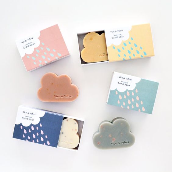
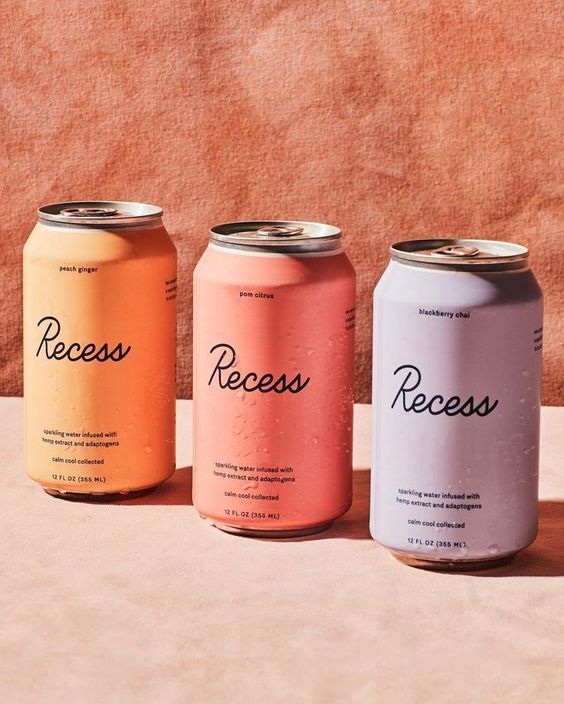
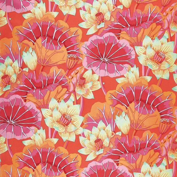
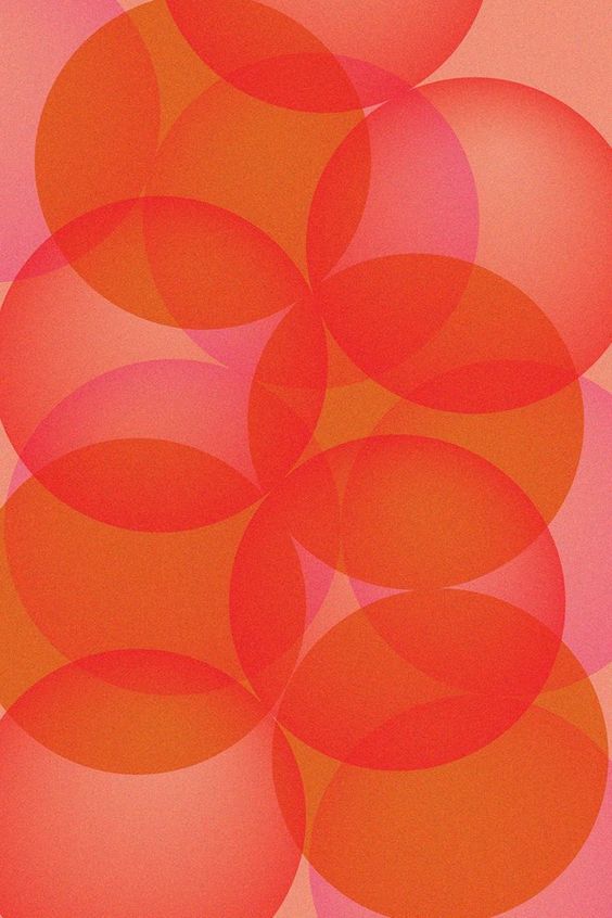
3. Pink Champagne
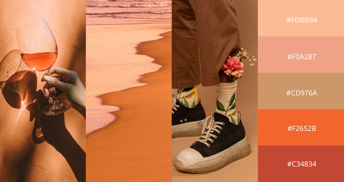 Reminiscent of pink moscato by the beach during sunset, this color palette is vibrant and adventurous with a hint of romance. The beige and pinks symbolize the feminine touch, whereas the burnt orange and crimson represent fiery passion and longing for escapism.
This stunning color combination works well with illustrations, minimalist design, social media posts, product packaging and so on.
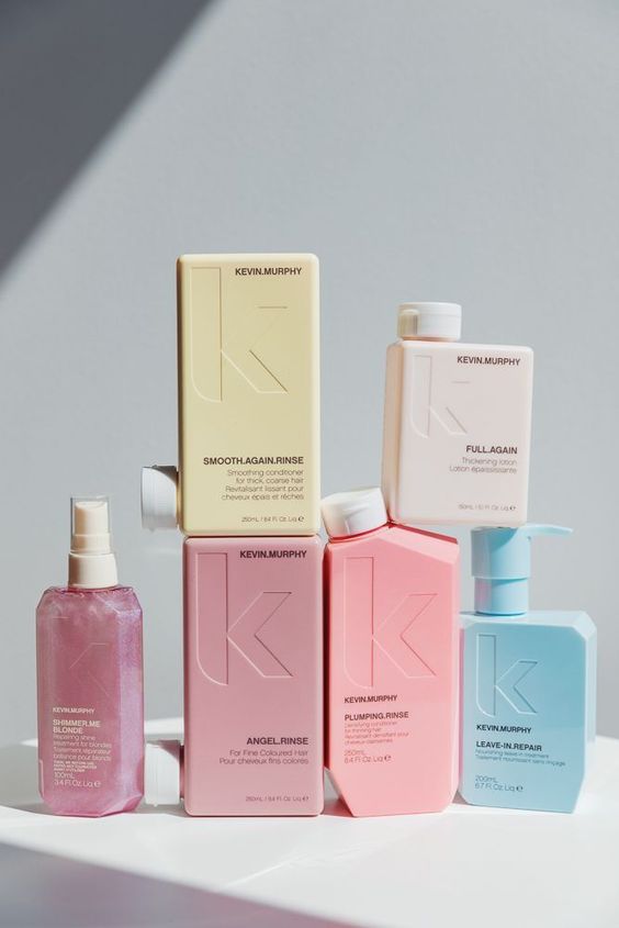
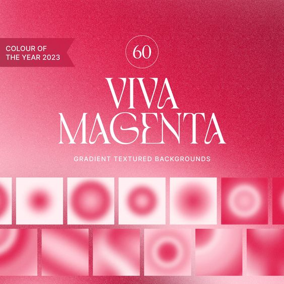
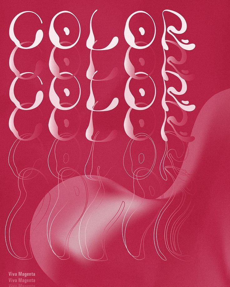
 4. Viva La Vida
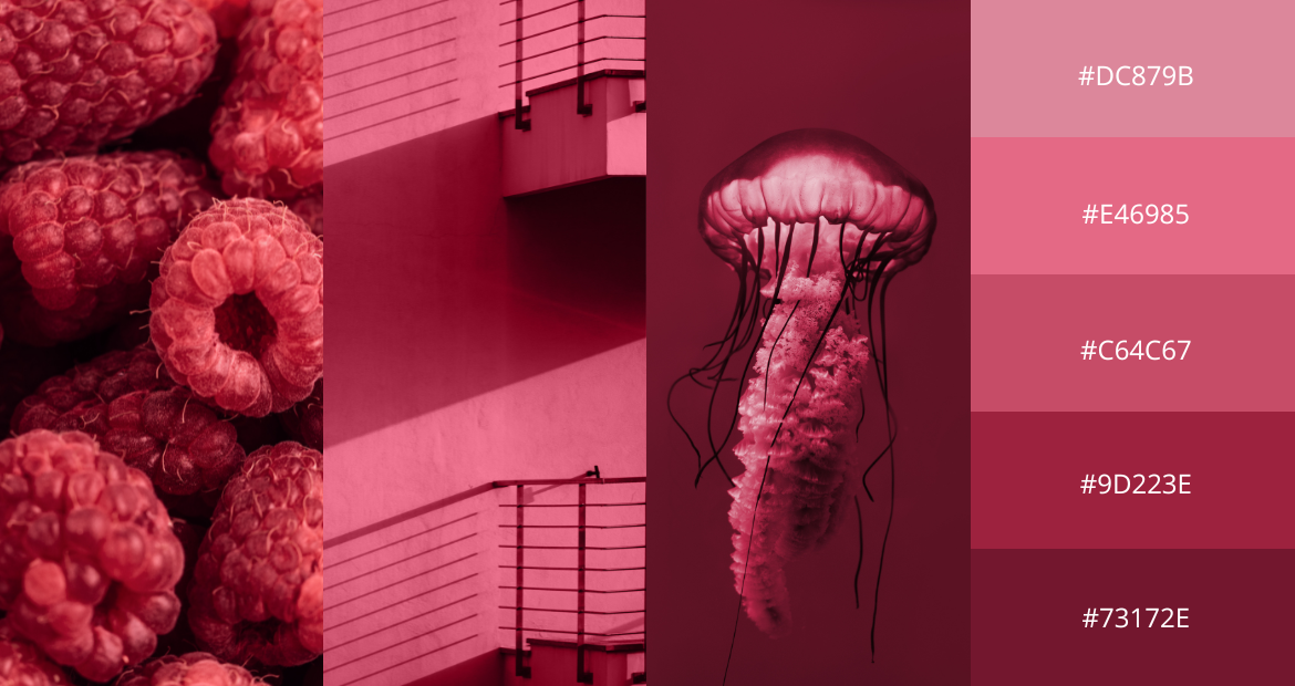 Pantone’s Color of The Year – Viva Magenta vibrates with vim, vigor and vivacity as its nuanced crimson red tone presents a balance between warm and cool. Not only is this color palette made to stand out, it is also made to encourage bold experimentation and boundless self-expression.
Exuding dynamism, this color palette can be used in almost anything, ranging from minimalist posters, gradient-themed designs to social media templates and business cards.
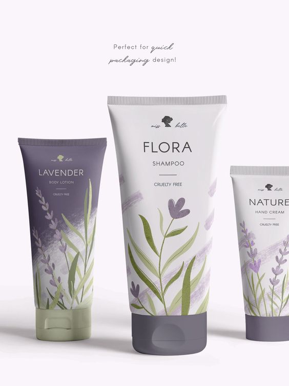
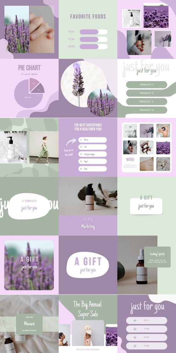
5. Lilac Dreams
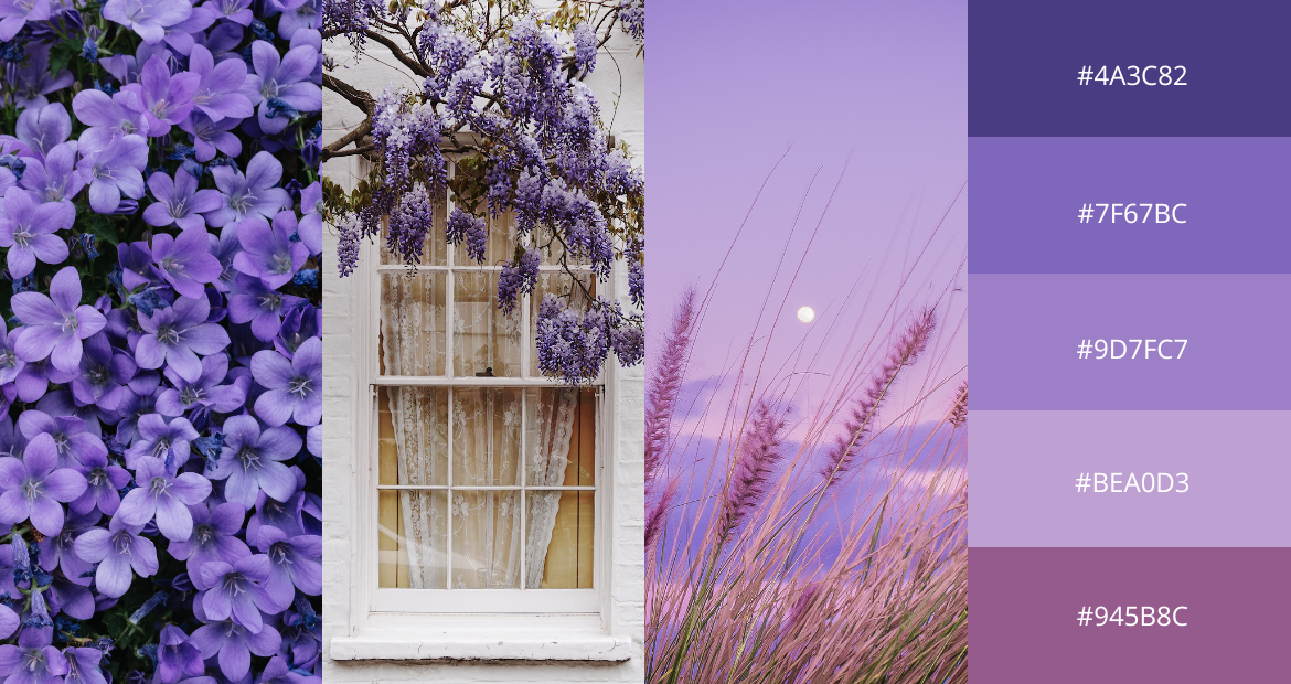 Here we have another monochromatic color palette to boost your mood and elevate your designs. This purple-hued color palette is very much inspired by the lavender fields of southern France – spirited, freeing and optimistic.
Similar to the viva-magenta-inspired color palette, this seamless mixture of lilacs and violets can be translated into graphic design, product packaging, home and interiors.
Start welcoming spring into your designs!
Now that we’ve shown you our collection of spring color palettes, you can use Pixlr and start incorporating these color combinations into your everyday artwork and designs.
Which one of these color palettes is your favorite? Share your work with us on social media by tagging @Pixlr on Facebook and Instagram – we’d love to see what you can create with Pixlr!