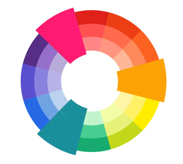
Triadic colors are three colors equally placed on the color wheel; thus, their positions form a triangular shape. When used correctly, the triadic color can create a playful, vibrant effect pleasing the eye.
In today’s article, we will show you the different variations of triadic color schemes and how to properly utilize them in your designs.
Once you understand what they are and how to use them, you will surely integrate them into your lifestyle, day-to-day fashion, interior design, and artwork.
So what are triadic colors, and how do we identify them?
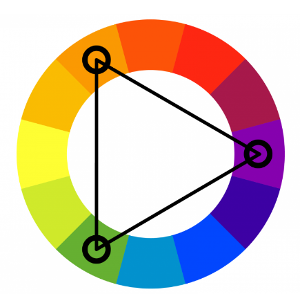
Triadic colors are really easy to identify on the color wheel. You can find them by placing an equilateral triangle on the color wheel. Each point of the triangle directs to a color that belongs in a triadic color scheme.
The following are perfect instances of triadic color combinations:
The powerful primaries: red, blue, and yellow
The fruit basket: orange, green and purple
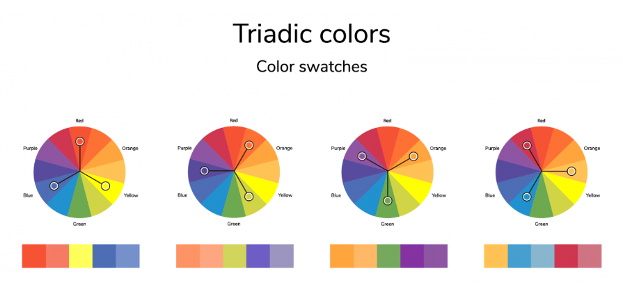
Here, you can see more variations of triadic color combinations and their respective color swatches.
How do we use triadic colors correctly?
When you use triadic colors in a design project, it is important to keep them balanced and use them in equal portions. For instance, choose one of the three colors as the primary color and use the rest as accent/complementary colors.

Here, you can easily see that the design is predominantly red (pink), whereas blue and yellow are the supplementary colors that enhance the overall color scheme and liven up an otherwise monochromatic design.
Of course, you can always switch things around and have blue as the main color instead. There aren’t any set rules as long as you know how to play within the boundaries.
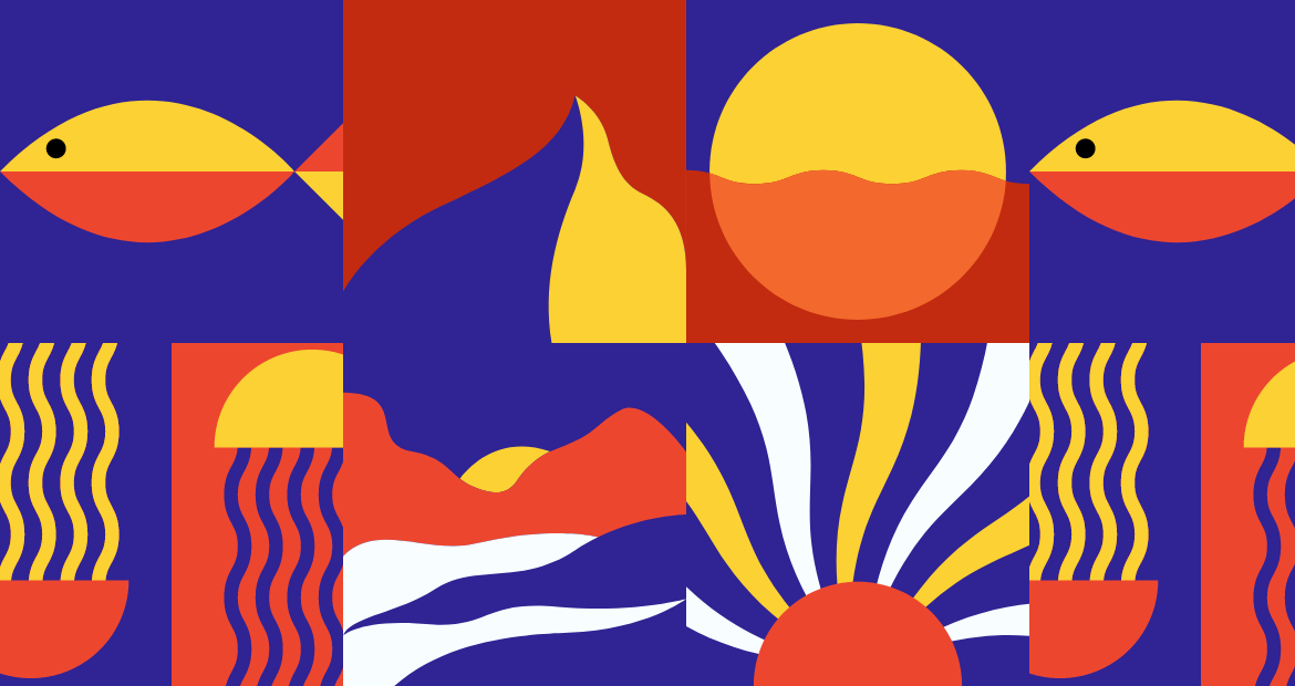
In this design, blue is definitely the dominant color whereas red and yellow are supporting colors that add drama to the overall design. The almost-orangey red creates a beautiful contrast against the deep rich blue as the vibrant yellow injects brightness into the saturated canvas.
How do we use triadic colors in a more subtle way?
Don’t let the idea of overly vibrant triadic colors scare you away! You can always tone down the effect simply by using a softer/more muted shade of color. For instance, instead of red, you use pink; instead of purple, you use lilac.
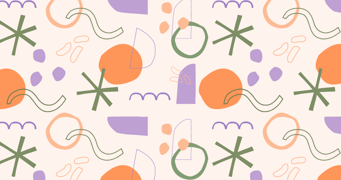
Here, we’re using a combination of lilac, moss green, and peach orange, with lilac being the dominant color. We’re balancing out the brighter orange shade with a muted purple and a dark green.
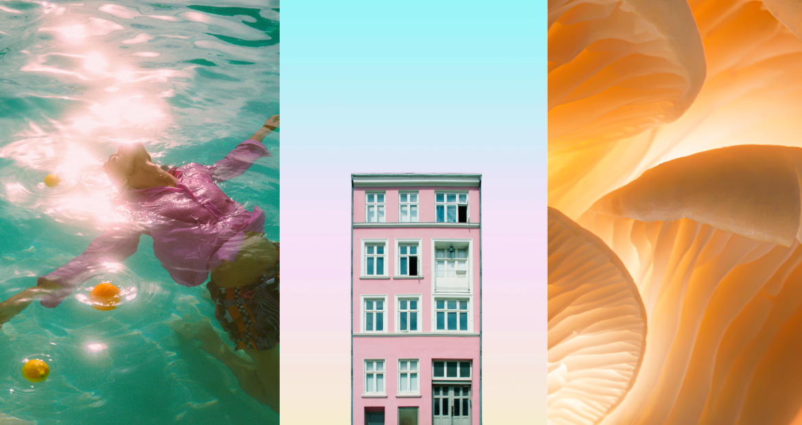
This is also another subtle way of utilizing triadic colors but in the form of photography. Here, we can identify magenta, teal, and orange – these three colors sit perfectly in a triangle on the color wheel.
Start using triadic colors with Pixlr today!
Now that we’ve shown you the different variations of triadic color schemes and various ways of using them, you can now comfortably and confidently create your designs with unique triadic color combinations.
We’d love to see your triadic-colored designs, share your work with us by tagging @pixlr on Facebook and Instagram.