Orange is a color that evokes feelings of warmth, energy, and vibrancy. But have you ever stopped to wonder, “Is orange really a color?” It might seem like an obvious answer at first, but just as we’ve delved deep into the question of whether black is a color in another insightful blog, we’re here to present you with the ultimate guide on the orange color.
1. What is Color?
Before we dive deep into orange, it’s important to understand what color is. Color is the characteristic of visual perception described through categories like red, blue, yellow, etc., with names that correspond to certain wavelengths of light. It’s a combination of an object’s inherent properties and the way our eyes perceive them. To put it simply, when light interacts with an object, certain wavelengths are absorbed and others are reflected, and our eyes pick up these reflected wavelengths, interpreting them as colors.
2. Delving Deep into Orange
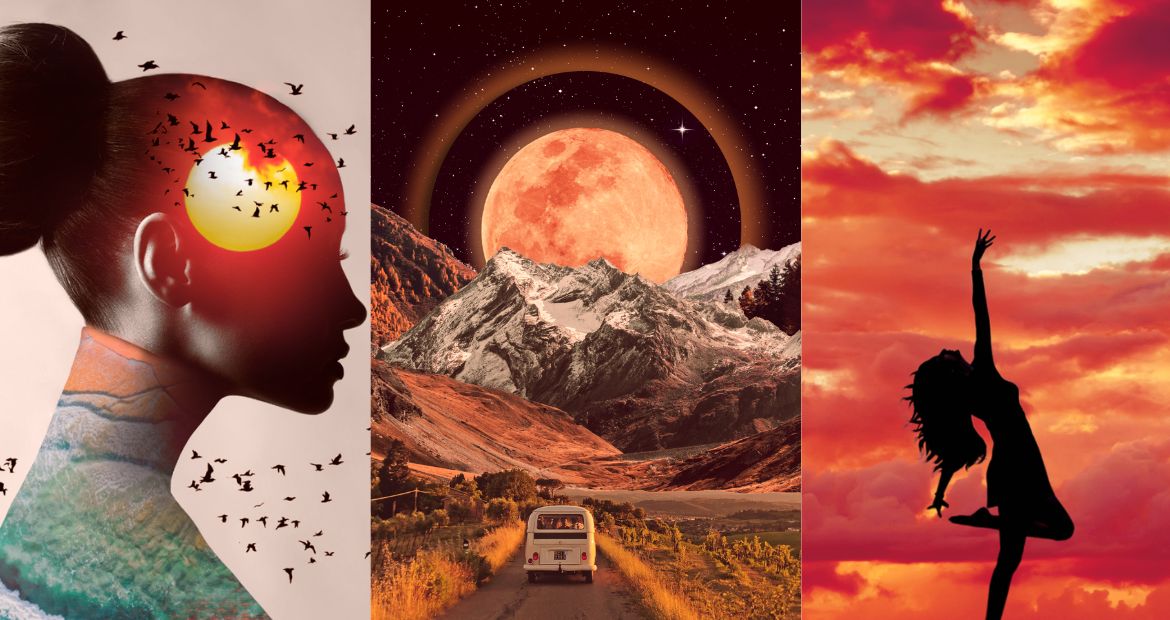
The color orange falls between red and yellow in the spectrum of visible light. Human eyes perceive it when observing light with a dominant wavelength between roughly 585 and 620 nanometers. But beyond its scientific definition, orange has cultural, emotional, and artistic significance.
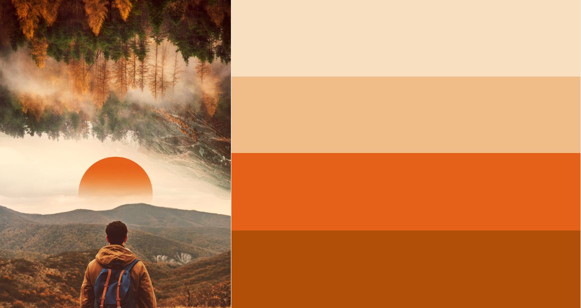
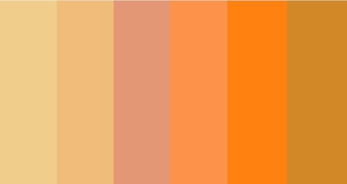
- Tints of Orange: These are variations of orange created by adding white. Peach, apricot, and salmon are some beautiful tints that are softer and often associated with femininity and tenderness.
- Tones of Orange: Add some grey to orange, and you get its toned versions. Burnt orange and rust are examples of orange tones that evoke a sense of vintage and nostalgia.
- Terracotta: This is a type of clay-based earthenware, but its rich, earthy orange color has made ‘terracotta’ synonymous with a shade of orange itself. It brings a natural, grounded feel to designs.
3. Is Orange Really a Color?
The answer is a resounding yes! Like all colors in the visible spectrum, orange has a specific wavelength that our eyes recognize. Unlike shades like black or white, which are often debated because they represent the absence or presence of all light respectively, orange is a distinct hue that stands proudly on its own in the spectrum.
4. Tips for Using Orange in Design
Orange is versatile, and its many tints, tones, and shades like terracotta offer a plethora of design opportunities. Here are some tips to make the most of this vibrant color:
- Balance with Neutrals: As energetic as orange is, balancing it with neutrals like beige, gray, or white can help achieve a harmonious design.
- Use as an Accent: An all-orange room might be overwhelming, but a pop of orange as an accent, be it in cushions, art, or accessories, can uplift any space.
- Combine with Complementary Colors: Blue and orange are opposite on the color wheel, making them complementary. This duo can create a lively and dynamic contrast.
- Go Natural with Terracotta: For a more subdued and earthy feel, opt for terracotta shades. They’re especially in vogue for pottery, tiles, and home décor.
Start Creating with The Color Orange, today!
In conclusion, orange, with its myriad tints, tones, and incarnations like terracotta, is indeed a color—a fascinating one at that. It’s a hue that’s as versatile in design as it is rich in its presence in the spectrum of visible light. Whether you’re pondering its existence or looking to use it in your next design project, we hope this guide has shed some bright, orange light on your queries!
Share your work of art with us by tagging @pixlr on Facebook, Instagram, and TikTok for a chance to be featured on our feed!